As Brighton gears up for Pride celebrations, we’re delighted to announce the release of an exclusive new piece by Rebecca Strickson – a Margate-based contemporary illustrator whose inspiring works embolden us to fight for a better future.
Strickson’s art is inspired by her love of trade union banners, and how, throughout history, they’ve been used as a powerful tool to unite people and communicate big ideas.
In today’s blog, we’re chatting to Strickson to learn more about how she creates each psychedelic artwork, and the important meaning behind her new piece.

A Lover and A Fighter is available now.
Fight for this Love
While outwardly beautiful, Strickson’s new piece – A Lover and A Fighter – also serves as a poignant reminder that Pride began as a protest, and that the right to be who you are and love who you love is still something the world needs to fight for. Strickson explains:
“We’re used to hearing that we’re one or the other; we either love, or we fight. But it’s still the case in 2023 that we queer people have to be both when we want to love whomever we want and be with whomever we choose. In reality, we have to be both a lover and a fighter for us to be safe to show love in public, hell just to exist! With this piece, I wanted to celebrate all the people who fought before us to allow love to be shown in all its beauty, diversity and fierceness.”
Standing Proud
As a queer, feminist, working-class artist, Strickson’s art is about encouraging people to come together and to rise up in support of those in need.
“Humans are capable of caring about a lot of things at the same time. It’s not a hierarchy of who’s worse off. The whole point of feminism is that you protect the weakest and the people who need it the most and that is the trans community. I don’t know how you can be a feminist and not support trans people. It’s unacceptable how people are hounded for what they are. It’s such a waste of time and energy. Think of all the great and wonderful things you could be doing with that time and energy. Think of everything you could be achieving!”
“In 2023, it’s not enough to just say ‘love is love’. The original pride was a protest and we need to get back to that. We need to get that anger back, because as in the famous words of John Lydon – ‘anger is an energy’ – and it is - it’s an incredibly useful force! It’s okay to be constructively angry at stuff, and it’s necessary. I really feel like if you’re not angry at the moment, you’re either not paying attention, or you have incredible privilege which means that you don’t have to worry. Nowadays, if you’re blind to the injustices in the world, I think that’s willful. Nobody is accidentally missing out on what’s happening. You’re choosing not to care. We need to keep loving each other, but we also need to keep fighting.”

Sacred Geometry
Strickson’s work is characterised by symmetrical organic curves and lines. Speaking of how she creates these mesmerising backdrops, Strickson tells us:
“People assume I use Illustrator but it’s all drawn by hand in photoshop. I use the symmetry tool so that I can get everything exact, and this means I only really ever draw one half of the backdrop. My pieces also often have more than one line or axis of symmetry in them, so quite often they’ll start just being vertical, and then I’ll add dual vertical or horizontal lines of symmetry. And then I’ll spin them around to create another version. Every piece is symmetrical, just done in a slightly convoluted way.”

True Colours
Looking at Strickson’s work, another element that jumps off the page is her selection of colours, chosen to complement the message of the slogan portrayed.
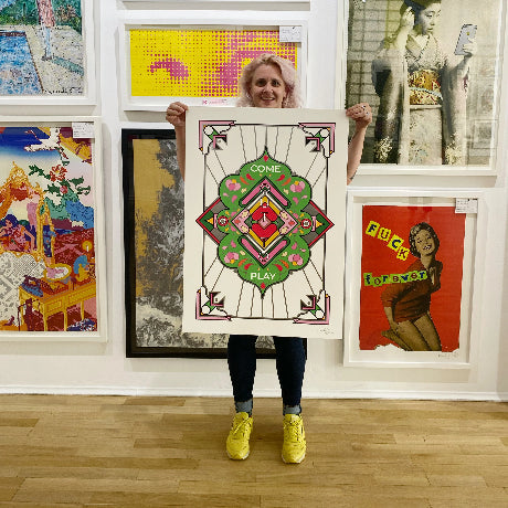
Examples include Come Out to Play, featuring summery shades designed to remind you of being outdoors, and Dreamweaver, with colours chosen to reflect the feel of twilight.
Speaking of her choice of colours in A Lover and A Fighter, Strickson tells us:
“This piece is very specifically green and pink because I felt like it needed to be really warm. I wanted it to be really intense but passionate, and I think these colours reflect that. I also just adore pinks and peaches and greens together. I like organic shapes and getting leaves and greenery into my work, because for me they represent growth and comfort.”
Creating Beauty
We love hearing about how Enter Gallery artists create their works, and what inspires each piece. Strickson reveals that she actually started her latest print after a couple of glasses of wine…
“I work in a studio with a lot of other artists and creatives and we had a really nice evening potting plants over a few glasses of wine, so I actually started working on the patterns a little drunk. Normally when I do that, I have to go back the next day and fix it but for the first time ever – it looked amazing!”
I was also looking back at a lot of my old prints when creating this piece because Wilderness Festival commissioned me to create six eight-foot billboards that will be placed around the festival site. They’re based on works from the last few years, I just had to make them a lot bigger!
It was nice to revisit my own work, and discover a couple of shapes and motifs I hadn’t used in my work for a long time like dots and dashes and different textures and patterns, so this piece was a great excuse to get those back in.”
A Lover and A Fighter is available exclusively at Enter Gallery now. Get yours here.