At Enter Gallery, we’re fascinated by colour and how it makes us feel. So much so that we collaborated with Lick to gain a deeper understanding of how art can be paired with certain colours to infuse your home with the emotions you want to experience in each room.
A question we’re often asked in the gallery is how to choose art for blue walls. Whether or not it’s your favourite colour, the timeless beauty of the colour blue is undeniable. Loved across cultures and generations, blue brings to mind some of the most beautiful things in life, from the ocean, to the skies, to a loved one’s eyes.
Given how often we’re asked the question, we figured it was high time we did some investigating. So, in today’s blog, we’re looking at what makes the colour blue so enduringly popular, and offering some tips on how to choose art for blue walls.
The History of Blue
Before we start, let’s quickly dive in to the origins of people’s fascination with blue. Apparently, humans started recreating blue colours an incredible 5000 years ago, and we’ve been doing so ever since.
Since Egyptian Blue was created by the Ancient Egyptians around 2200BC to emulate precious stone, Lapis Lazuli, we’ve seen thousands of shades of blue created – from Yves Klein’s International Klein Blue created in Paris in the 1960s, to last year’s 2022’s Pantone Colour of the Year, Very Peri – a colour designed to ‘enhance creativity and show off a lively attitude’.
The Psychology of Blue
Tash Bradley is the Colour Psychologist and Director of Interior Design at Lick Paint. Tash explained that “blue is the colour of the mind”, and that whether via blue walls, or striking works of blue abstract art, it is a calming colour, with the ability to evoke clarity and increase intuition, while promoting relaxation and tranquillity.
Blue doesn’t just have mood-boosting effects either – it can apparently also lower blood pressure, slow the heart rate and boost productivity.
Many Shades
No matter your tastes, there are hundreds of shades of blue to choose from, and even better news is that almost all colours can be paired with blue with just a little thought, from the most vibrant hues of red and orange, to more muted greys and greens.
If you’re in the process of painting your walls blue, Tash encourages you to consider how you want to feel in the room you're decorating. She explains: “The lighter the shade of blue, the more mentally soothing it is. The darker the shade of blue, the more mentally stimulating it is.”
5 tips for pairing art with blue walls
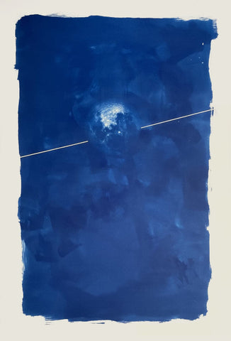
1 – Stick with the mood
If you’ve chosen your particular shade of blue to make you feel relaxed, the last thing you want to do is opt for an artwork that makes you feel the opposite of that. Therefore, when pairing art with blue walls, Tash advises thinking about the specific feeling you want to experience when in the room.
“Think about how you want to feel when you’re in that room. Are you looking to create a calming space, or do you want to feel energised, stimulated and focused? Your answers will help inform your choices of colour, and of art.”
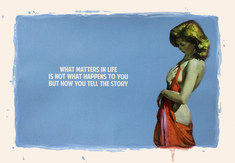
2 – Complements, complements
It’s always a good idea to find artworks that have accents in the same shade as your blue walls. Not only will this really make your artwork pop, but it will establish a fun colour palette that you can then extend to other furnishings and embellishments, such as lamps, cushions, or even flowers.
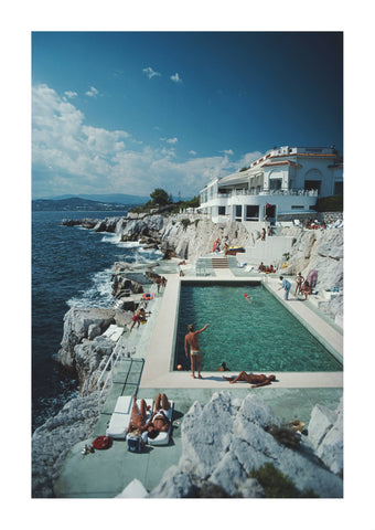
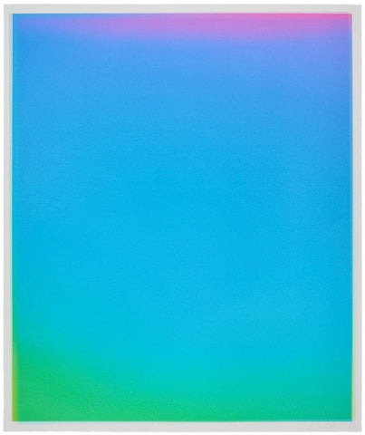
3 – Bold and Beautiful
For something bolder, choose art with contrasting colours to your blue walls. The simplest way of finding colours that actually work together is to refer to the colour wheel, which will provide you for multiple options for dynamic combinations that work beautifully.
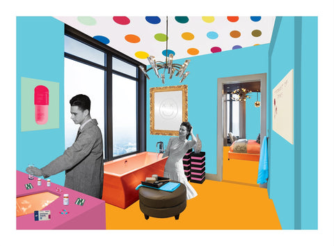
Let’s take orange as an example, which sits directly opposite blue on the colour wheel. This means that no matter the shade, the colours always look great together, plus the combination is said to have an energising effect.
Blue also works well with neutral shades, and with their neighbours on the colour wheel, such as greens and purples, so bear that in mind when choosing your art.
4 – Light and dark
Should your blue walls be on the darker end of the spectrum, you’ll want to choose art that brings some light to the room. You can do so by choosing pieces that feature whites or greys, by choosing accent colours like the oranges and yellows mentioned above, or by opting for framing in white frames, or lighter woods, such as maple, ash or birch.
5 – Trust your Instincts
Finally, when choosing art for your blue walls, rely on that one thing we all have in spades – our intuition! All rules aside, if you like an artwork, and it makes you feel happy, chances are that you’ve found the perfect piece to adorn your walls.
We’ll leave you with one final piece of advice from Tash, who always advises her clients to choose what feels right for them:
“The artworks you choose should tell the story of people who live in the home, so how you choose to decorate your home should reflect your personality. Make choices that make you feel good regardless of what others are up to.”