This week, The Great Escape Festival makes its long-awaited return to Brighton. Over three days, our city’s bars and pubs will be packed with music lovers, catching new talent and up-and-coming acts set to take the entertainment industry by storm.
With the sound of music in the air, we’ve been thinking about the unique relationship between music and art, and how often one informs the other and vice versa. With this in mind, in today’s blog we’ve compiled a countdown of our Top 10 album covers and record sleeves that are undeniable works of art.
10 – Rio by Duran Duran – Tape Deck Art

Rio is the double platinum selling second album of dapper 80s heroes, Duran Duran. When the band’s record label handed over creative control of creating the unique visual style of the album to the band, they turned to American artist, Patrick Nagel, to create this iconic image.
Speaking of the quintessential 80s woman captured on the album artwork and immortalised in the band’s biggest banger, Rio, Nick Rhodes commented: 'I think it has aged rather beautifully, like the Mona Lisa of the 1980s.'
Tape Deck Art has recreated the album cover in his signature Giant 3D Vintage Pin Badge form. Each numbered badge is individually aged and hand-finished making every badge unique.
9 – Manhattan Boogie Woogie by Landscape – Peter Blake We all know Sir Peter Blake is a dab hand at designing an album cover, with absolute classics like The Beatles’ Sgt Pepper’s Lonely Hearts Club Band and Paul Weller’s Stanley Road under his belt. But we can’t get enough of Blake’s collage for the cover of Manhattan Boogie Woogie – the 1982 album of English synth-pop band, Landscape.

Instantly-recognisable as a piece by Blake, the colourful collage is inspired by the visual cultures of the 1930s and 40, when boogie-woogie music was enjoying its heyday.
Packed into Blake’s silkscreen print are nods to cultural icons, Jimmy Stewart and Louis Armstrong, as well as the work of Matisse and Dutch abstract artist, Piet Mondrian.
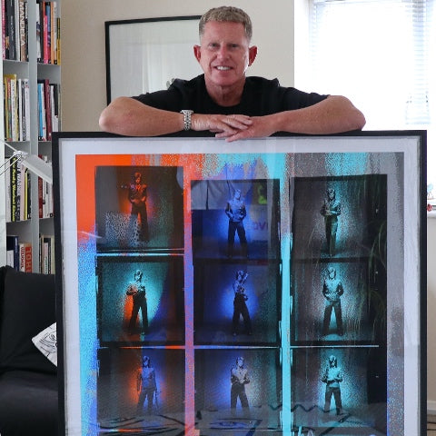
8 – Rocket to Russia by The Ramones – Tape Deck Art

In another of his music-inspired pieces, Tape Deck Art has immortalised the cover of Ramones album, Rocket to Russia. Released in 1977, a year considered to be the peak of the punk rock genre, this album was the last Ramones record to feature all four original members of the band.
As the name suggests, the cover art for the album portrayed a military theme, with anti-communist cartoons created by American illustrator and Punk magazine editor, John Holstrom. The original album artwork now resides in the Rock and Roll Hall of Fame in Cleveland, Ohio.
7 – Urban Hymns by The Verve – Michael Spencer Jones

Michael Spencer Jones has been the man behind the lens for some of the most recognised music and album photography of our generation. But would you believe that the cover of Urban Hymns by The Verve (which remains the 18th bestselling album in the history of the UK charts) was captured entirely by chance?
Apparently, the recording of the record was particularly gruelling for the band. When Spencer Jones rocked up to photograph the band in London’s Richmond Park, he was able to snap this picture when the band were enjoying a rare moment of relaxation. He reveals:
‘I happened to glance over and noticed that it was the first time in months that The Verve appeared relaxed, so without a thought, I went over and grabbed the shot whilst they were still unaware. The band loved the image and decided it should go on the cover.'
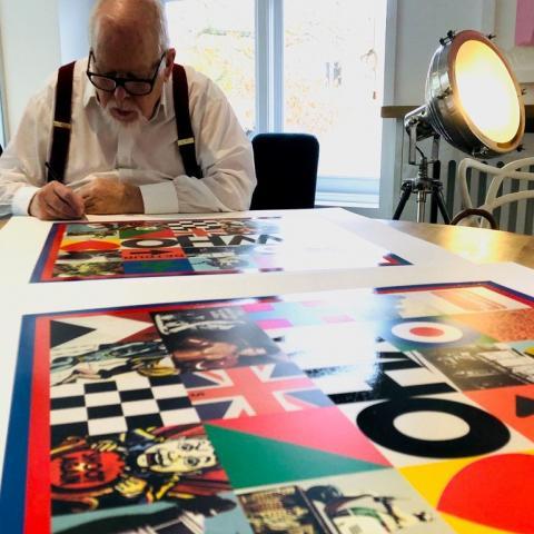
6 – Live Aid/ Band Aid – Peter Blake

It’s only fitting that one of the most historic music events of the 20th century, was given its artwork courtesy of pop culture aficionado, Sir Peter Blake.
This set brings together the cover Peter Blake designed for 1984 Band Aid charity single, ‘Do They Know It's Christmas Time?' and the Live Aid Global Jukebox Poster, which the artist designed for the 1985 Live Aid concerts. Both the single and the concert were organised to raise awareness and funds for famine-stricken Africa.
In a style reminiscent of the artist’s coveted Classroom Suite, Blake contrasts starving African children against a snug festive scene for the single. For the poster, Blake includes an array of the ephemera for which he is well-known, including ticket stubs, photographs of the venue and a map of the world.
5 – Definitely Maybe by Oasis – Michael Spencer Jones

When it comes to Oasis album covers, it’s difficult to choose a favourite, but when pushed, it absolutely certainly has to be Definitely Maybe.
Just like Be Here Now, this album sleeve was captured by master, Michael Spencer Jones – who spent five years touring with Oasis, capturing their rise to fame and creating their album covers.
The image was captured in Oasis guitarist, Bonehead’s house. Spencer Jones reportedly instructed Liam to lay on the floor to detract from the wooden floors, which he feared would make the shot look like an advert for varnish. The band were asked to bring objects that meant something to them, which included a framed photo of George Best and a still of actor Gian Maria Volonté from A Fistful of Dollars.
4 – Unknown Pleasures by Joy Division – Tape Deck Art

Despite being recorded over the course of just three weekends and being the only album released during lead singer, Ian Curtis’s lifetime, Unknown Pleasures by Joy Division is consistently listed as one of the greatest albums of all time.
The cover, immortalised here by Tape Deck Art, is based on data signals from a radio pulsar. It was designed by British artist, Peter Saville – an art director known for creating album artwork for the likes of New Order, Roxy Music, Wham! and Peter Gabriel.
3 - Aladdin Sane by David Bowie – Anthony Freeman

Of all the photos of David Bowie, the cover of Aladdin Sane, featuring his red hair and the lightning bolt across his face, is the image that endures.
Aladdin Sane was the follow up album to The Rise and Fall of Ziggy Stardust and the Spiders from Mars - the record that launched Bowie to superstardom. The title is a play on words, hinting at Bowie’s frame of mind as he balanced his newfound stardom with the pressures of touring the USA.
This piece by Anthony Freeman gifts us a rare behind-the-scenes look at the photoshoot for one of the most-loved David Bowie albums of all time, and the alternative images that didn’t quite make the final cut.
2 – Dark Side of the Moon by Pink Floyd – Storm Thorgerson

Of all the Pink Floyd albums it was Dark Side of the Moon that was the biggest smash for the band. Despite only hitting the top spot in the US for one week, the record stayed in the Billboard album chart for an incredible 736 weeks between 1973 to 1988, and is consistently listed as one of the 'best albums of all time.'
The original album artwork was created by Storm Thorgerson, who was inspired by a photograph he’d found of a prism with a colour beam projected through it.
This silkscreen print depicts the reworked album cover, also designed by Thorgerson, created for the album’s re-release in celebration of the record’s 30th birthday. Remixed from original recordings captured at Abbey Road, the anniversary record features the same music, only with a richer, more detailed audio experience.
1 – God Save the Queen by the Sex Pistols – Jamie Reid

For our number one spot, we're breaking the rules...and we're sure the Sex Pistols would approve of our anarchy.
While God Save the Queen was technically a single rather than an album, the artwork for the single, created by Jamie Reid, has been described as ‘the single most iconic image of the punk era’ and that's good enough for us!
This artwork, featuring the Queen with a punk safety pin through her lip, caused quite the scandal when it was released to coincide with the Queen’s Silver Jubilee in 1977. In addition to being defaced, the Sex Pistols’ song called the Queen a ‘moron’ and referenced Britain’s ‘fascist regime’.

Such was the uproar surrounding the song, the BBC even stepped in to stop the smash hit reaching number one in the charts – despite the single selling over 200,000 copies in its first week. Without a shadow of a doubt, God Save the Queen is an iconoclastic work of British art history.
Discover more music-related art in our Music Category