When you look around the walls of Enter Gallery, one of the first things to hit you is all of the colours. Our walls are adorned with graphic prints and colourful artworks in every colour of the rainbow, and we find that colour is often one of the first things that makes our customers say, ‘wow’.
You may think colour is a simple choice, but it is so much more than just a shade. It has the power to affect us on a deep, almost inexplicable level. Colour can create a mood, provoke an emotion, or promote a particular state of mind.
Given its power, it’s little wonder that artists throughout history have turned to colour to add depth and context to their masterpieces.
In today’s blog, we’re diving into a world of colour, looking at how some of the greatest artists of all time have approached using colour, and how their choices have influenced many of the contemporary artists whose colourful wall art you can find at Enter Gallery.
“Colours, like features, follow the changes of the emotions.”Pablo Picasso.
The History of Colour Psychology
The Ancient Egyptians are credited with inventing almost everything from mathematics to medicine, but it’s less well known that they were also the first to investigate colour and its effect on our moods, thoughts and behaviour.
Their civilisation were the first to discover that orange has an energising effect, that red stimulates the body and mind, and that blue has the capacity to soothe pain. There is evidence to suggest that the Egyptians used this insight to begin using coloured light and materials as a means of healing.
This knowledge that colour has the ability to change how we feel has been harnessed ever since, from Leonardo Da Vinci meditating bathed in lavender light to stimulate his creativity, to Norwich City Football Club painting their away dressing room ‘deep pink’ in 2018 to lower the testosterone levels of their opponents.
A Whole Mood
The ability of colour to provoke a particular reaction is something that was explored by Wassily Kandinsky, one of the leading figures in the Expressionist movement – a group known for their bold experimental approach to colourful art.

Composition X (1939) by Wassily Kandinsky
Kandinsky is known for vibrant and energetic artworks, and he wrote extensively about his belief that shape and colour can affect our mood, stating: "Colour provokes a psychic vibration. Colour hides a power still unknown but real, which acts on every part of the human body."
 Orange and Yellow, 1956 - Mark Rothko
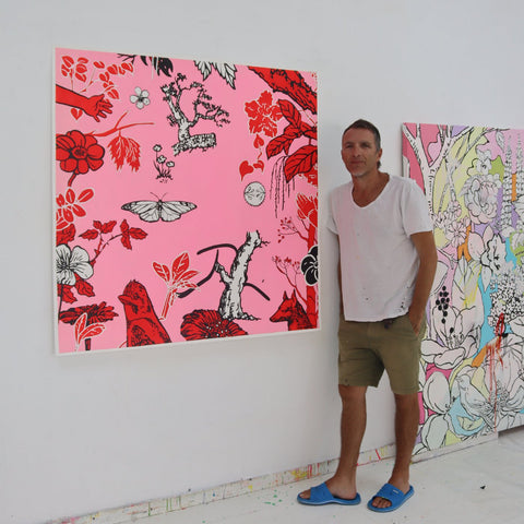
More recently, Mark Rothko was another icon of the art world whose entire career was defined by his understanding of how colour can evoke emotion. His moving colour-field paintings are a clear inspiration on contemporary artist, Boo Saville, whose vivid abstract works explore the relationship between colour and emotion.
Looking at how artists use their work to evoke a mood, designer and artist, Yinka Ilori’s entire oeuvre is based around the joy of colour and its capacity to uplift and unite us all. His instantly-recognisable colour palette, which is inspired by his Nigerian heritage, has brought much-needed colour to forgotten corners of cities around the world.

Happy Street in London, Yinka Ilori
Conversely, The Cameron Twins are an artistic duo who use a sickly sweet, over-saturated colour palette taken from childhood TV shows, books and toy packaging to deliberately create a sense of unease. They explain:
“From the outside, our works look colourful and cute, but we love inserting sinister elements, like our colour palette. It invites the viewer to question the effects of nostalgia on their own memories. To ask themselves, ‘was that actually how I remember it or was it actually a lot darker than that? Over the years, have I shaped the memory into something it wasn’t?’”
The Mind of the Artist
Stepping back in time once again, let’s look at the work of one of the most infamous painters of them all - Vincent Van Gogh – an artist who used colour to hint at his own state of mind.
Van Gogh created over 2000 paintings over the course of his life, with his colour palette moving from dark to brighter and more intense colours as the years went on, something that has been attributed to his mental state. He famously stated:
“Instead of trying to reproduce exactly what I see before me, I make more arbitrary use of colour to express myself more forcefully.”

Vincent Van Gogh, The Night Café, 1888
This is an approach we saw mirrored by Pablo Picasso, who famously had a three year, Blue Period from 1901-1904, when he was experiencing depression following the tragic suicide of his friend. During this period, Picasso only painted in melancholy shades of blue and grey.

Pablo Picasso, The Old Guitarist. Created late 1903–early 1904.
This glimpse into the mind of the artist is something we see in the works of Dan Baldwin, an artist who uses his work to explore the juxtapositions of modern life, and the topics that preoccupy his thoughts. Combining abstract and figurative elements, Baldwin uses his fierce, dynamic aesthetic to explore love, memory, politics and the discomforts of modern life.
Facial Expression
Henri Matisse was so obsessed with colour that it went beyond mere aesthetics, becoming a language of its own.
Matisse rose to prominence during the early 20th century as part of the Fauvist movement. The name ‘fauvism’ translates to ‘wild beasts’, which is how people saw this group’s untamed approach to colour. Matisse stated, “The chief function of colour should be to serve expression. Colour helps to express light, not the physical phenomenon, but the only light that really exists, that in the artist’s brain.”

WOMAN WITH HAT, 1905 – Henri Matisse
When it comes to using colour to infuse additional expression into their subjects, we look to the works of American artist, Bradley Theodore, and British artist, Caroline Chinakwe.
Inspired by Matisse’s approach to colour, Theodore uses wild and non-natural colours to convey the aura of his subjects. Similarly, Chinakwe colourful portraits shine a light on the complexities of people of colour, while celebrating black culture and style.
“Colour is my day long obsession, joy and torment.”
Claude Monet.
Defining Colours
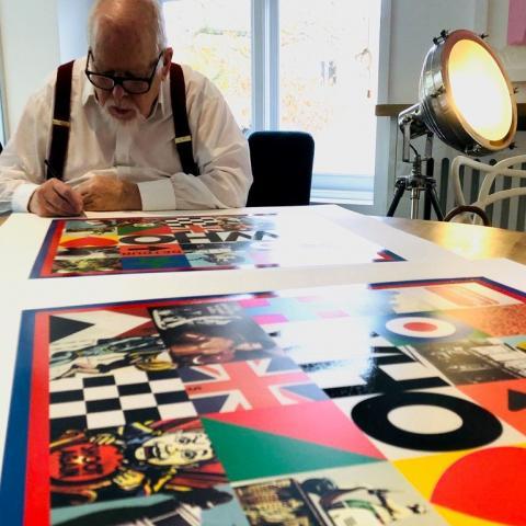
From Van Gogh’s use of yellow and Yves Klein’s blue, to Peter Blake’s Pop Art palette, another unique way artists have used colour to define their artistic careers is by adopting specific colours or shades that immediately identify an artwork as one of their own.
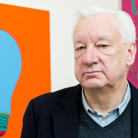
Michael Craig Martin is another artist who boasts a signature colour palette so distinctive, you can spot one of his works a mile off. By juxtaposing the familiarity of the objects he depicts with non-naturalistic, intense hues, his colourful artworks enjoy more visual impact and emotional intensity. He reveals:
“I was frightened of using colour for a long time, it is quite daunting. I wasn’t until later in my career that I stumbled on it, which came from doing installations. I did one in a gallery in Rome and the building was old and full of character, not a white cube at all. For the first time I painted the walls in colour, and my life changed forever.”
Enjoy reading this blog? Sign up to our newsletter to receive more blogs like this straight to your inbox.


