When art and music combine, the result can be iconic. Continuing our exploration into the relationship between art and music, we have been looking back at some of our favourite record cover artworks…
Zeitgeist by Smashing Pumpkins
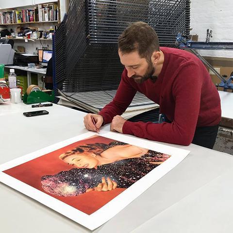
To capture the mood of the time for their album titled ‘Zeitgeist’, Smashing Pumpkins called on prolific street artist, Obey aka Shepard Fairey to design the cover.
Featuring the Statue of Liberty drowning in a red sea with the sun ambiguously either setting or rising, the artwork symbolised the demise of many of the ideals upon which the USA was founded.
Speaking about the choice of the colour red Obey said, “I use red frequently because it is a visually powerful, emotionally potent colour. Red gets people’s attention. In this case there is the added possibility that the red liquid could be blood, giving it an even more sinister sense of foreboding. A red helps people to realize immediately that something is wrong and the image is not a soothing postcard.”
The Who
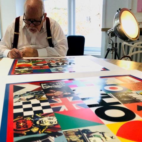
For The Who’s first studio album in 13 years, Sir Peter Blake produced the official album artwork to mark the momentous occasion.

Featuring a medley of cultural icons in a colourful grid reminiscent of Blake’s ‘Sources of Pop’ series, the artwork was also made into an animation for the official videos for two songs from the album, ‘Ball and Chain’ and ‘All this music must go’.
The artwork later became a highly collectable limited edition of 150 silkscreen print
Loving in Extraordinary Times by James
Renown for exploring the juxtaposition between power and fragility. Magnus Gjoen’s art complimented James’ album which explored themes such as the space between politics and tranquillity.
Titled ‘Living in Extraordinary Times’ the name refers to the unprecedented political and social movements that the band found hard to comprehend, such as Brexit and Trump becoming president. Vocalist Tim Booth said, ‘We knew something was up when Leicester City won the league, then Brexit, then Trump. It is as if we slipped into an alternate reality, a Philip K Dick reality. We are living in extraordinary times.”
Damien Morris from the Guardian says the album "evokes everything from dystopia to disgust, truculence to triumph, selling each emotion equally well, with bug-eyed passion rippling through every line."
Magnus Gjoen later released the artwork as a limited edition print titled, 'Loving in Extraordinary times'.
Beat Bop by Rammellzee and K-Rob
Originally released in 1983 at the height of his career, Jean Michel Basquiat designed this now very rare cover after a disagreement with Rammellzee.
The track was initially intended as a battle rap between Rammellzee and Basquiat, following heated arguments between the two. Rammellzee, an influential graffiti artist himself, accused Basquiat of being a fraud. In turn, Basquiat claimed he could out-rap, out-dance, and out-paint anybody. The duo eventually settled on "Beat Bop" acting as an outlet for this tension. The track has been cited as having an influence on artists such as Beastie Boys and many hip hop artists due to its chaotic, abstract sound. The result was a ten-minute track featuring Rammellzee and K-Rob on vocals, under the direction of Fab Five Freddy.
The record was eventually released in 1983, limited to 500 copies with custom art by Basquiat.
See our new Basquiat Skateboard by The Skateroom.
Music for the Jilted Generation by The Prodigy
A cover to match an album of ferocious power, ‘Music for the Jilted Generation’ features a screaming metallic face designed by Stuart Haygarth. The idea for the cover emerged after band member, Liam Howlett found a plaster head at Camden market and asked Haygarth to sculpt it as it were breaking through skin.
Often compared to ‘The Scream’ by Edvard Munch, it is one of The Prodigy’s most iconic and recognised album covers.
Maxim from The Prodigy is also a visual artist - See his work here.
Bionic by Christina Aguilera
Street artist, D*Face is known for artworks that explore the fascination with celebrity, consumerism and cultural figures.
“I wanted to encourage people to not just to ‘see’, but to look at what surrounds them and their lives, reflecting our increasingly bizarre popular culture, re-thinking and reworking cultural figures and genres to comment on our ethos of conspicuous consumption. A Pandora’s box of bittersweet delights, sweet and sugary on the surface, but with an unfamiliar, uncomfortable, taste beneath.
Christina Aguilera’s is an avid collector if his work and commissioned him to design the cover for her 2010 album ‘Bionic’.
Rendering the singer into a humanoid robot, the ‘Bionic’ artwork featured D*Face's famous logo and name as well as elements from Aguilera’s personal life such as "Jordan" (for her husband at the time) and "Max" (her son) incorporated into the elaborate design.
Eephus by Janelle Monae
Sourcing vintage magazines from second-hand stores, Joe Webb reworks original imagery, using simple and concise edits to build new visual narratives. After seeing his work in 2015, Janelle Monae asked Joe Webb to design her ‘Eephus’ album cover.
‘I like the format of the album cover as an artwork. Artists like Storm Thorgerson who made all of Pink Floyd’s sleeves, or Peter Blake. There was a time where I’d buy records just based on the covers without knowing what the music sounded like.’ Joe Webb
My Beautiful Dark Twisted Fantasy by Kanye West
When Kanye West deliberately set out to create a controversial album cover that would be banned, he commissioned visual artist, George Condo to create the provocative design.
Hip Hop album cover imagery has been no stranger to censorship but by turning to the medium of painting over photography, the desired shock from West’s album cover is more akin to Manet’s Olympia or Chris Ofili’s Holy Virgin Mary.
Outrage towards painting seldom results in a ban – more a rethinking of the avant-garde or the start of the cultural moment. Still, the album cover was pixelated before it hit the shelves or replaced with the alternative ballerina image Condo created.

Along with Jean-Michel Basquiat and Keith Haring, Condo was instrumental in the international revival of painting from the 1980s onward. During this period he worked in Andy Warhol's factory, primarily in the silkscreen production studio applying diamond dust to Warhol's Myths series.
Sgt. Pepper’s Lonely Hearts Club Band by the Beatles
Arguably one of the most iconic album sleeves of all time, ‘Sgt. Pepper’s Lonely Hearts Club Band’ was released by the Beatles in 1967 with artwork by Sir Peter Blake and his then-wife Jann Haworth.
The collage originated from an idea to show the band performing in a park and gradually evolved to include 88 people from historical figures to celebrities.
Blake said, "I offered the idea that if they had just played a concert in the park, the cover could be a photograph of the group just after the concert with the crowd who had just watched the concert, watching them." He added, "If we did this by using cardboard cut-outs, it could be a magical crowd of whomever they wanted.”
Screamadelica by Primal Scream
Frequently named one of the best albums of the 1990s, ‘Screamadelica’ is the third studio album by Scottish rock band Primal Scream and produced by Andrew Weatherall.
The album cover for Screamadelica was painted by Creation Records' in-house artist Paul Cannell. Cannell was allegedly inspired by a damp water spot he'd seen on the Creation Records offices ceiling after taking LSD.
Power, Corruption and Lies by New Order
Pioneering designer, Peter Saville created a colour-based coding system to spell out the name of the band and title of this album. The coloured wheel to decode the wording is printed on the back of the album and was used for the subsequent single releases.

The flowers are a reproduction of the painting, ‘A Basket of Roses’ by Henri Fantin-Latour which was originally refused usage before Tony Wilson called The National Heritage Trust, who owns the painting, to dispute the refusal. When he was told the actual owners were “the people of Britain” he famously replied, “Well, the people of Britain now want it” and an amazing piece of design was born.
We love Chris Kettle’s take on Fantin-Latour. Inspired by the old masters, but far from traditional, fine artist Chris Kettle has developed what he calls ‘New Still Life’: painting familiar objects in unexpected arrangements, these works are a true visual embodiment of the uncanny.
The Dark Side of the Moon by Pink Floyd
“I like photography because it is a reality medium, unlike drawing which is unreal. I like to mess with reality… to bend reality. Some of my work begs the question of is it real or not?” Storm Thorgeson
Hailed as one of the greatest album covers of all time, Storm Thorgerson’s design was inspired by a photograph of a prism with a colour being projected through it after keyboardist, Richard Wright requested a simple and bold design to represent the band's lighting and the themes of the songs.
There have been many theories on the meaning of the title of the album, from the revelation that Apollo 10 astronauts could hear a kind of music on the 'blind' side of the moon, to the connection between the moon and madness, to the darker side of ourselves we all hold within us.
Shop Storm Thorgeson
Rumours by Fleetwood Mac
Photographed by Herbert Worthington, Fleetwood Mac’s ‘Rumours’ album featured singer, Stevie Nicks dancing around in dark robes as her mythical Welsh witch stage persona, ‘Rhiannon’. She is holding hands with drummer, Mick Fleetwood who rests his foot on a stool and displays two wooden balls dangling in front of his crotch.

The balls were Mick's personal good luck charm. Spotted in a pub toilet hanging from the chain flush toilet, he stole the balls to hang on his drum kit.
Love Fleetwood Mac's lyrics? Check this out.
Norman by Mark Vessey
Ok so not strictly a record cover, more of a record spine… but we couldn’t talk about records without mentioning Mark Vessey who has created artworks capturing the significance of music collections.
His unique approach to photography takes neatly stacked collections, honouring them with the respect they deserve. Creating art from the ordinary in a modern take on pop art.
His collaboration with Norman Cook aka Fatboy Slim, saw him photographing Norman’s personal record collection and documenting the albums which had influenced him during his career as well as the albums we created.
Like having his own personal collection that shaped his career in your home. The significance of the collection as one body of work to be enjoyed by others. It is found art but also a way of documenting and celebrating the art of collecting. Creating art from the ordinary as a modern take on pop art.
Read about our new exclusive with Mark Vessey.
Albino Ballerina by Mike Edwards
Sometimes a commission for a record cover design can spark an artistic career in musician portraiture…
Passionate about music from an early age, Mike Edwards was in his own band before going on to play a stage set for Blur’s ‘Modern Life is Rubbish’ tour. After meeting various musicians he went on to create his first art an music combo – a record cover design for a band called Sweet Jesus on their cover for Albino Ballerina.
Velvet Underground Andy Warhol
An album cover that embodies Andy Warhol’s signature style, showcasing mundane objects (such as a banana) and celebrating them as works of art.
Arguably the most famous banana in the world, early copies of the album featured a peelable banana skin, revealing a sexually charged, flesh-coloured banana underneath. “The banana actually made it into an erotic art show,” Lou Reed once said.

A special machine had to be employed to manufacture the covers which caused the release to be severely delayed. However, the connection to Warhol was viewed by their label as a major key to their success and ultimately it became a factor in making it one of the most influential pop albums of all time.

The album initially sold poorly when it was released in March 1967 and was largely ignored by contemporary critics. Selling just 30,000 copies in its first five years, musician Brian Eno commented in 1983 that despite selling 30,000 copies, "everyone who bought one of those 30,000 copies started a band!"
Dan Baldwin Paolo Nutini
Dan Baldwin’s work is often contradictory, opposing forces such as good/evil and love/hate are juxtaposed to create an uncomfortable visual paradox. Paolo Nutini chose this aesthetic to capture the music for his album, with the equally contradictory title, ‘Caustic Love’.
‘Cyclone’ was re-imagined into 6 separate single covers from the album. With another artwork, ‘Faithless’ used for the inner gate-fold on the vinyl and on the CD insert.
His artwork also made an appearance as the tour backdrop. Gaining worldwide TV coverage.
Royal Blood Dan Hillier
Blending Surrealism and Neo-Victoriana, Dan Hillier’s unique aesthetic was spotted by Brighton-based band, Royal Blood who chose the ‘Pachamama’ artwork to accompany their debut album.
“He was looking for something really feminine. I had to have a think about it because she’s quite precious to me, I really love that picture. I’m very glad they did use it, as it’s great to get it out there. It works as a good counterpoint to the music, which is very masculine." Dan Hillier.
Royal Blood’s Mike Kerr said, “Dan’s ability to illustrate and interpret our music into mystical imagery and hypnotic beings is truly unique. We fell in love with his work earlier this year and feel very privileged to know and work alongside him.”
Demon Days by Gorillaz
Jamie Hewlett is a Grammy award-winning British artist most famous for conceiving the animated band, Gorillaz with Blur frontman, Damon Albarn in 1998.
Starring in surreal music videos in a fictional universe, the animated Gorillaz characters presented endless creative opportunities for Hewlett. Sometimes they would even perform arena tours on video screens or in hologram form.
Speaking about the Gorillaz characters, Hewlett said, “they seem to be more relevant today than they were when we first met them, for some reason and I think that might have something to do with the fact that people are tired of celebrities, because we live in a society where everyone’s a fucking celebrity, and usually they’re a celebrity for doing nothing and so it’s easy to really dislike real celebrities, whereas I think there are things about cartoon characters that are timeless and endearing.”
Think Tank by Blur
Released in May 2003, Think Tank is a concept album, about "love and politics" according to Blur , frontman, Damon Albarn. At the time of the release, Albarn spoke out about the invasion of Afghanistan and took part in the widespread protests against the war. The album features frequent anti-war themes within the lyrics as well as the artwork and promotional videos.
The album cover was stencilled by the illusive graffiti artist Banksy. Normally avoiding commercial work, Banksy defended his decision to do the cover;
"I've done a few things to pay the bills, and I did the Blur album. It was a good record and quite a lot of money. I think that's a really important distinction to make. If it's something you actually believe in, doing something commercial doesn't turn it to shit just because it's commercial. Otherwise you've got to be a socialist rejecting capitalism altogether, because the idea that you can marry a quality product with a quality visual and be a part of that even though it's capitalistic is sometimes a contradiction you can't live with. But sometimes it's pretty symbiotic, like the Blur situation.”
The album's cover art sold at auction in 2007 for £75,000.
Have a Banksy to sell? Read more.
Keep following us at @enter_gallery to see more of our favourite album artworks on Instagram and Facebook


